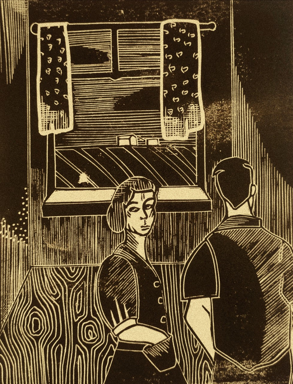
At first I thought I wanted to keep the series of prints in black and white but after looking at them all together I thought they looked too harsh, the third picture (3) I tried to add grain and soften the look of the white which gave it a yellow tone I did this on the app Vsco on my phone. I did like this but then I remembered the Tirza Garwood inspired drawings I did in red, so I changed the colour of the lino to red and white on photoshop (2) and then put the photo in the app and added the tinted filter and the grain which is what the first image is. (1) I think this gives the image more depth and has more likeness to the era I am trying to portray I also think it gives the series more warmth than a harsh black and white which does reflect the tone of the poem better.


Comments
Post a Comment